On Chinese Fonts I Know
To get out of debt, my father ever worked hard in a project of bus destination indicators. I was quite young back then, and was totally impressed by hundreds of rigid placards with different words, all in one standard face. A question was quickly raised in my mind: what is the similar look of all words there?
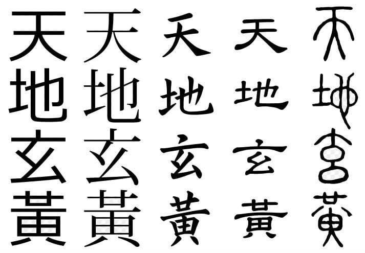
It was Ming typeface, the most widely used Chinese font family since woodblock printing invented in China hundreds of years ago. As we could easily guess, it’s associated with China’s Ming Dynasty, when the font originated. It has a very close variant, called Sung (Hanyu Pinyin: song4) typeface, not really originated in Sung Dynasty, but officially named by the Great K’ang-hsi Emperor 300 years ago, for political reasons.
In typography, Ming is the standard serif font in Chinese printing industry, equal to Times New Roman for English. In today’s computers, Windows OS comes with SimSun and NSimSun for Simplified Chinese, MingLiU and PMingLiU for Traditional Chinese; Mac OS has Li Song Pro and LiSungLight for all Chinese.
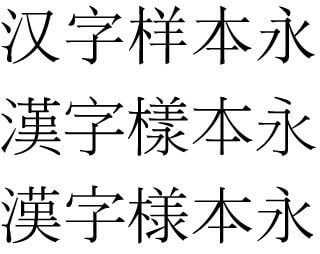
Inevitably, Japan’s relevant heritage is necessary to be introduced for most Chinese cultural topics. So there are Japanese variant of Ming, with sushi flavour probably. In computer, say MS Mincho and MS PMincho in Windows OS, HiroMinPro in Mac OS.
Subsequently, I have to get Internationalisation (i18n) involved, because we have CJK characters to take care of. CJK stands for Chinese, Japanese and Korean, whose written language contains Chinese characters, that is, Han-tze (Hanyu Pinyin: han4zi4) in Chinese, Kanji in Japanese, Hanja in Korean (sometimes Chữ Nôm in Vietnamese is included, so collectively CJKV). This traditional East-Asian writing system usually consists of more than 40,000 individual characters. Therefore typeface development with a reasonably complete coverage of CJK library would be much more complex than any other alphabet-based language’s. I really appreciate those hard-working Chinese typography engineers and artists making it happen, with beautiful fonts to read Chinese comfortably on both papers and screens.
Recently Google partnered with Adobe released an open-source pan-CJK typface, Source Han Sans, which is available now on popular Web font service Typekit. I’m glad to see such technological advancement, despite not a fan of most sans serif Chinese fonts, such as Microsoft YaHei. And for pretty Chinese Web fonts, I think justfont and decomoji have done a great job with better collections.